New base maps of Providence, RI
Summary
In 2015, I created a new set of base maps of Providence, RI to provide a staff of data analysts at ProvPlan/DataSpark with a ready template upon which they could create other maps.
Context
Data analysts on staff frequently had to create maps of Providence illustrating the location of various places. Frequently, staff would need to recreate from scratch an underlying map of the city to provide context for whatever particular set of features was being highlighted. This meant doing a lot of the same work over and over again for many projects.
Goal
The goal of this project was to create a set of ready-made maps of the city, upon which staff could add new layers to show specific information. These base maps would have a number of versions giving different sets of city features as context, including neighborhoods, wards, Census tracts, and more. The base maps needed to be created using ArcGIS because that is the program staff used to create maps. Finally, the new base maps were intended to be both visually attractive and provide genuinely relevant information to orient map viewers.
Process
This map went through many iterations. Here are a few of the decisions around layers to include:
- First, it started with just the street network. This is an important starting point because it gives people a frame of reference for being able to locate things.
- The key realization was the inclusion of building shapes. In addition to making it feel more like a “filled-in city,” it also provides viewers with valuable information about different types of land uses in different parts of the city — as buildings taking up large amounts of space tend to indicate institutional or industrial uses, while large numbers of small buildings indicate more residential areas.
- I added the city’s parks to show the sections of the city that people think of as “green.” Just like highways and buildings, these serve as important landmarks. Also, if they weren’t shown in green, parks would simply appear as empty space given the lack of buildings in them. I went with a very subtle shade of green in order to not have the color be too overpowering.
- In the end, removed all streets except highways. Thanks to the inclusion of building shapes, it’s pretty obvious that streets can be found in the linear blank spaces between buildings. Including both building shapes and streets makes the map very busy, which we were trying to avoid, because these maps are intended to provide a background upon which other information is added, so it was key to be judicious with what was included. But highways were kept due to their being important reference points in the cityscape: major arteries for drivers and major dividers for pedestrians.
Combined, these features help the map “feel” like the city that people know, all through the restrained use of color and shapes.
During the process, I consulted others on staff to get feedback on the maps.
Result
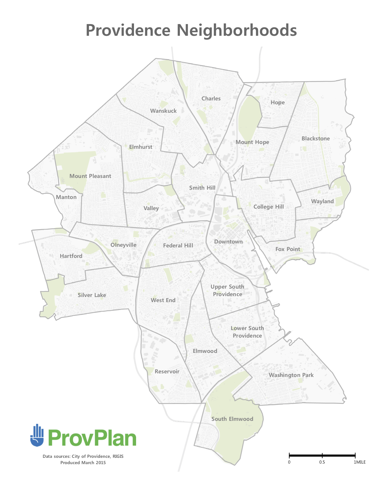
Here are a few of the base maps:
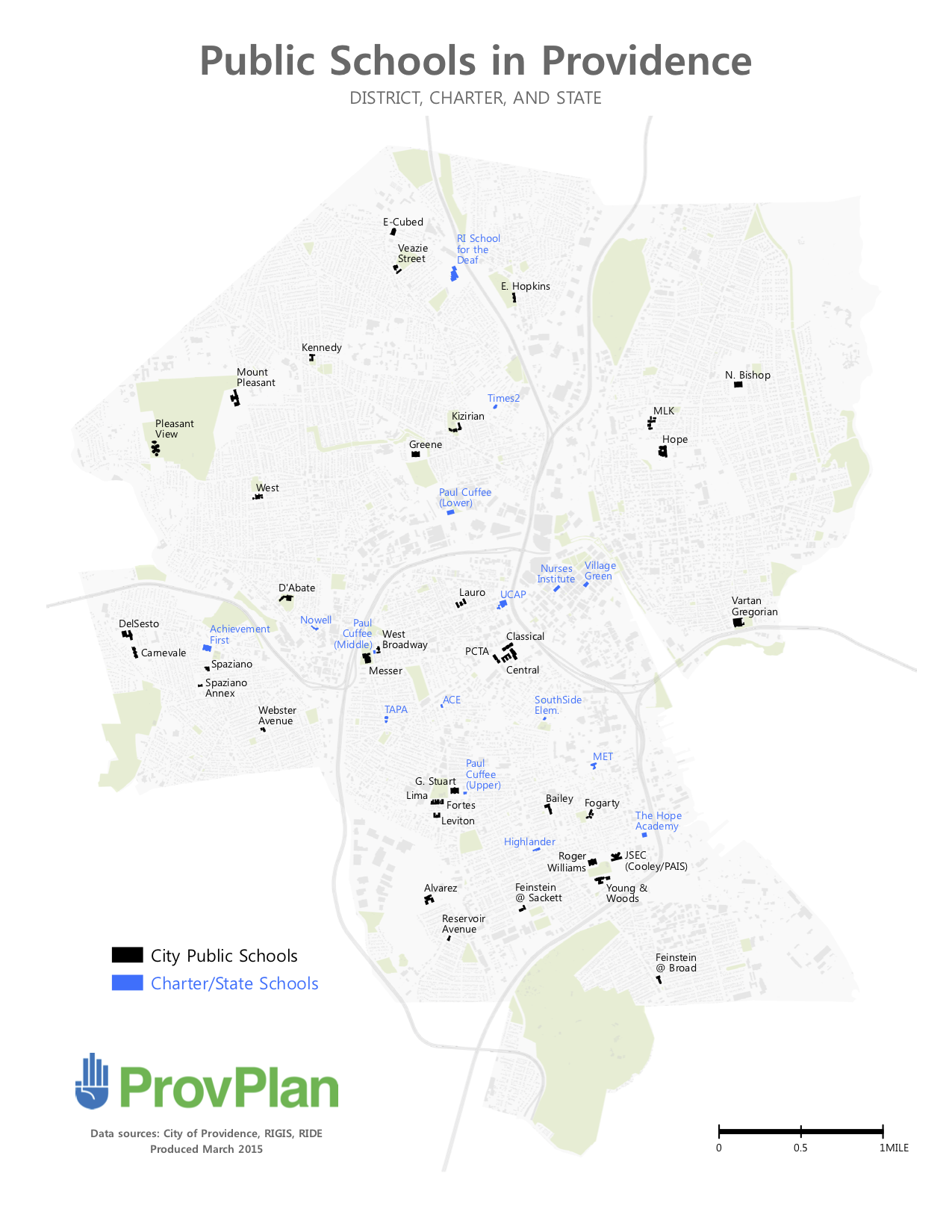
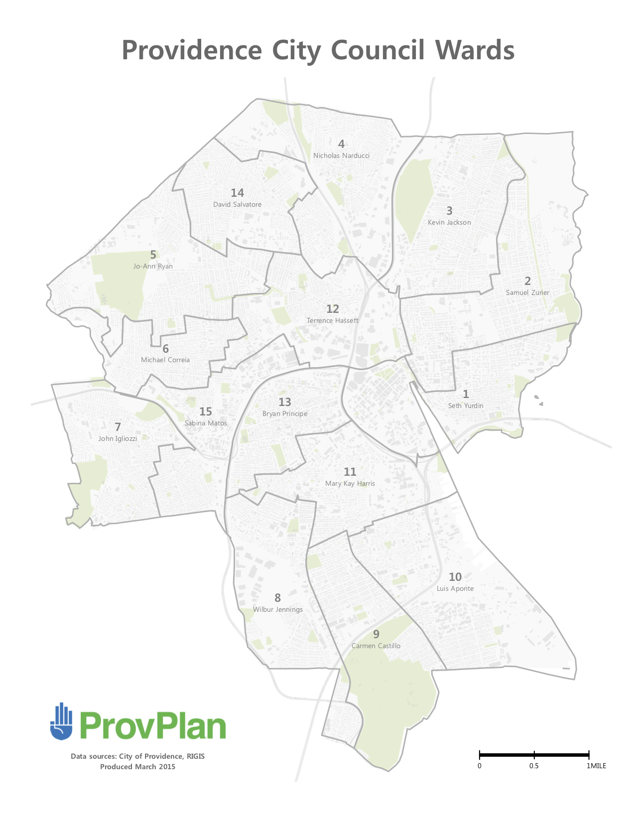
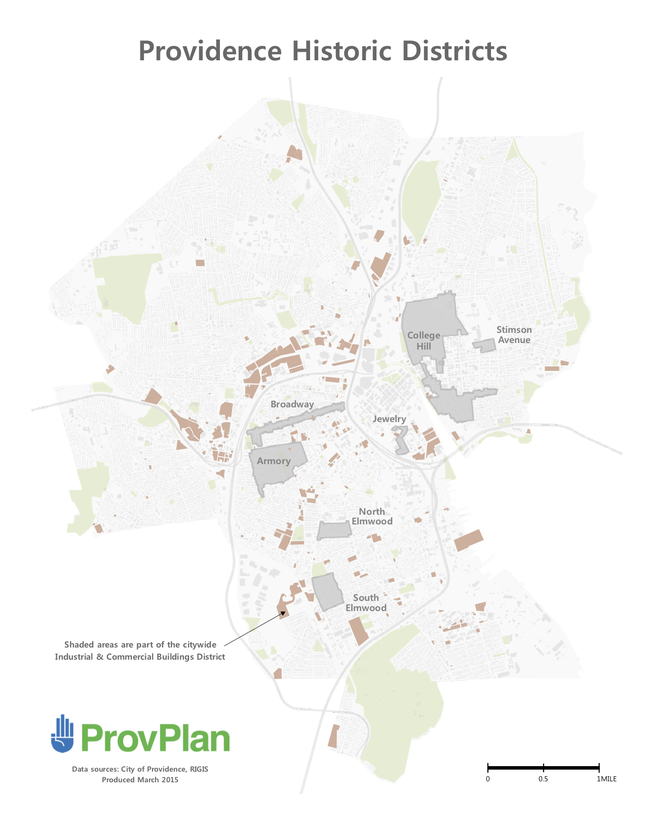
You can find more of the maps on this page.
In retrospect
Overall, I’m pleased with how the maps turned out. They have served their intended purpose. I think they look good, and others have said the same.
That said, I wish there had been a higher priority on speaking to external people who would be the “consumers” of these maps.
Although the most immediate users of my maps would be others on staff, they were not the ultimate target audience. As such, it was important to get the opinions of those on staff, but I wish I/we had also solicited external opinions. Specifically, I wish we had spoken to outsiders both before the project (to get a sense of what types of city features people use as references) and during (to get feedback on the designs).
As for the internal side of things — if I were doing this over, I would have first gone to others on staff to hear more details about their needs, desires, and pain points.