The problem with GTFS transit mode categories
They focus on form instead of function.
One of the largest problems we have with the way we talk about transit is that we focus our language on technology instead of service. This is true both in the United States and in many other countries.
One of the most important and surprising things I’ve learned from Jarrett Walker is the importance of language around transit. For example, the usage of the term line versus route.
This brings us to the General Transit Feed Specification, the industry standard for sharing transit schedule data. GTFS data is released as a set of tables, each representing different data points — stops, stop times, trips, etc. One of the files, routes.txt, contains information about each service/line/route, including a number indicating the mode of transit. The GTFS mode categories (route_type) are as follows:
- 0 - Tram, Streetcar, Light rail. Any light rail or street level system within a metropolitan area.
- 1 - Subway, Metro. Any underground rail system within a metropolitan area.
- 2 - Rail. Used for intercity or long-distance travel.
- 3 - Bus. Used for short- and long-distance bus routes.
- 4 - Ferry. Used for short- and long-distance boat service.
- 5 - Cable car. Used for street-level cable cars where the cable runs beneath the car.
- 6 - Gondola, Suspended cable car. Typically used for aerial cable cars where the car is suspended from the cable.
- 7 - Funicular. Any rail system designed for steep inclines.
These categories aren’t bad per se. They do represent the modes. But the larger issue here is that GTFS places an emphasis on mode, focusing on differences that largely don’t matter while glossing over those that really do. The distinctions between some of these modes are fuzzy, and the descriptions explicitly state that some encompass both short- and long-distance service, two entirely different beasts.
Let’s say we’re interested in looking at the things we think of as “subways.” GTFS has a category for Subway/Metro. Great! Except… a subway-like service could really be operated on at least four other mode categories:
- Tram/Streetcar/Light rail (example: much of Los Angeles Metro Rail)
- Rail (many lines in and around Tokyo, including the Yamanote)
- Bus (genuine bus rapid transit, like TransMilenio)
- Gondola/Suspended cable car (Wuppertal Schwebebahn)
Despite the fact that these all offer a fairly similar type of service, they’re portrayed as being quite different. Worse, these categories lump these services in with others they have little in common with. Los Angeles Metro Rail (the light rail portions) shares a category with mixed-traffic streetcars, the Yamanote Line shares a category with once-a-day long-distance Amtrak lines, TransMilenio gets lumped in with buses that run on infrequent and erratic schedules, and the Schwebebahn shares a category with tourist gondolas. The distinction between these modes is based on technological differences that don’t necessarily impact the type or quality of service. People are being told to pay attention to a difference that may or may not be worth paying attention to.
Basically, this terminology focuses on form instead of function. Imagine if we classified roads according to surface material. Yes, it’s true that dirt and gravel roads are likely to be minor roads, so road surface does have some relationship with type. But what about concrete versus asphalt? Material doesn’t tell you if it’s a minor residential street or a major expressway, and also doesn’t convey whether it’s car-only, pedestrian/bike-only, or something in between.
Why is this so problematic for GTFS in particular? Because it means transit agencies across the world are being forced to define their services in terms that aren’t very useful, which limits the utility of what can be done with the data, reinforces the general public’s discussion of transit in terms of technology instead of service, and reinforces stereotypes about different transit technologies.
On that last point, Google Maps establishes a visual hierarchy of transit by showing different stops at different zoom levels; if you’re zoomed close enough, you see all modes, but zoom out and bus stops disappear, then streetcar/light rail stops, then subway stops. Furthermore, if you click to show transit, lines are given a thickness based on mode instead of frequency. What we end up with is a map that equates once-an-hour buses with those that run every 6 minutes, and mixed-traffic streetcars with subway-like light rail. This is a huge impediment to changing the public’s understanding of transit service.
Check out the following screenshots from Google Maps:
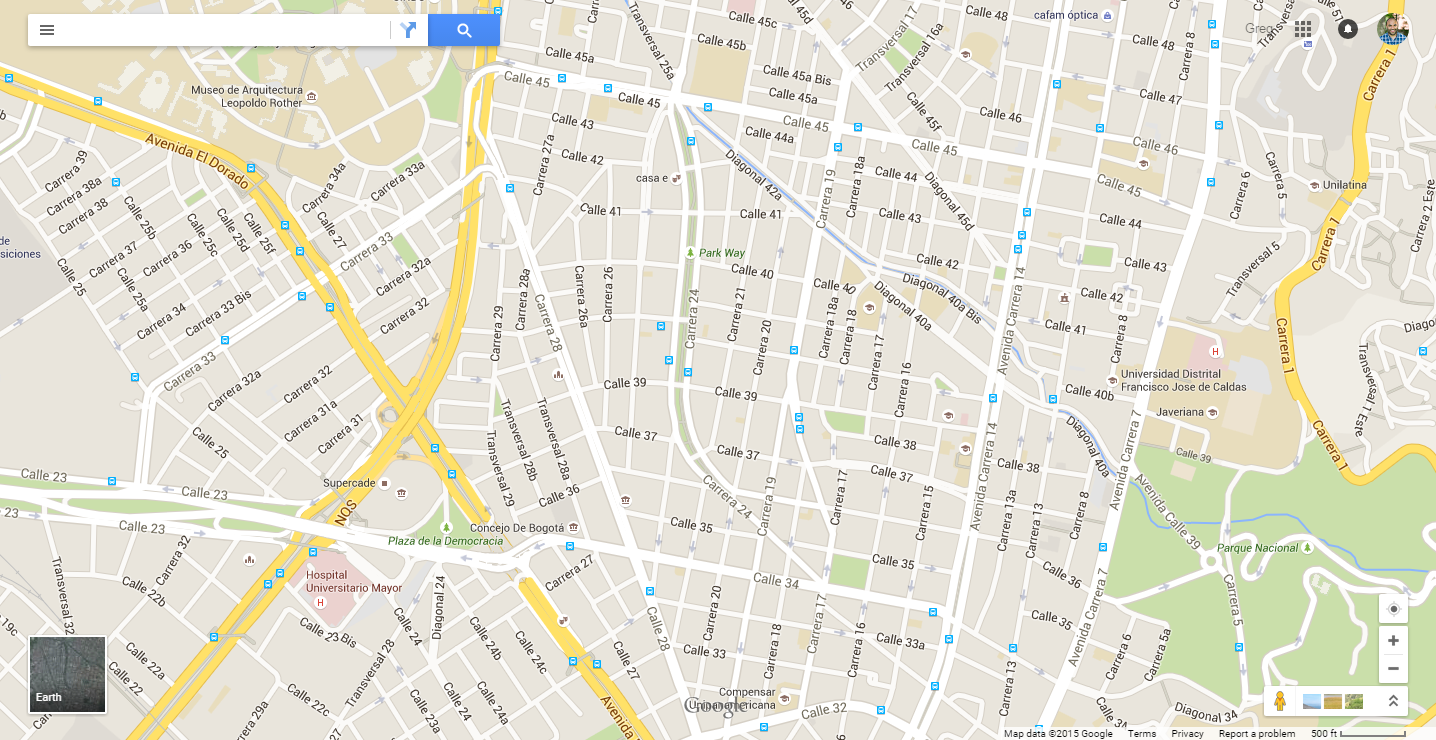
This is Bogotá, Colombia. Notice how there’s a sea of bus stops, all with the same symbol and no differentiation — despite the clearly different categories of service that exist. In particular, TransMilenio bus rapid transit is not shown as being a higher category of service than other buses.
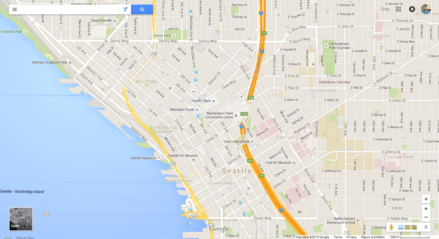
Here’s downtown Seattle. There are two big problems here. The first is that two quite different services are both classified as “Tram, Streetcar, Light rail” and thus displayed the same way: the Central Link light rail (at the bottom-center of the image) and the South Lake Union Streetcar (at the top-center). The Central Link (weekday ridership 37,350) is Seattle’s premier transit service, with a dedicated right-of-way, grade separation for much of the route, and stops that average over a mile apart. On the other hand, the SLU Streetcar (weekday ridership 2,600 and only 1.3 miles long) runs in mixed traffic with stops a little over a fifth of a mile apart. These are two entirely different types of services and should not be visualized the same way. The second problem with the map is the absence of high-quality bus routes, notably Seattle’s RapidRide network. RapidRide lines “service fewer stops (40% less than the routes they replaced), make extensive use of transit signal priority to preempt traffic lights and on some lines, use semi-exclusive lanes to bypass traffic.” RapidRide (daily ridership 57,000) runs with headways of 10 min or less during peak hours and 15 min or less at other times. But instead of having any hierarchy of bus services, they’re all presented the same on this map, and you have to zoom in two levels from the view above in order to see any/all of them.
What should we do about all this? Develop a way to describe transit that focuses on service instead of technology, and actually use it in the real world. In a future post, I will lay out such a classification scheme.
Note: Not all of the real world examples given here publicly release GTFS data (though some do). I am using these cases simply as examples of how transit services are categorized.