You don’t have to be tech-savvy to benefit from open data
Open data can power tools and resources that are usable by anyone.
Note: This post also appears on the Sunlight Foundation blog.
Open data can help you even if you know nothing about data, because it can power tools and resources that are usable by anyone.
This was on clear display recently at TransportationCamp, an unconference that focuses on the intersection of transportation and technology. Several developers from Mapzen ran a session presenting some of the open-source mapping tools they’ve been working on recently.
One in particular, the Mobility Explorer, allows users to visualize and understand local transportation networks. For example, here’s a map of all transit lines around Washington, D.C.:
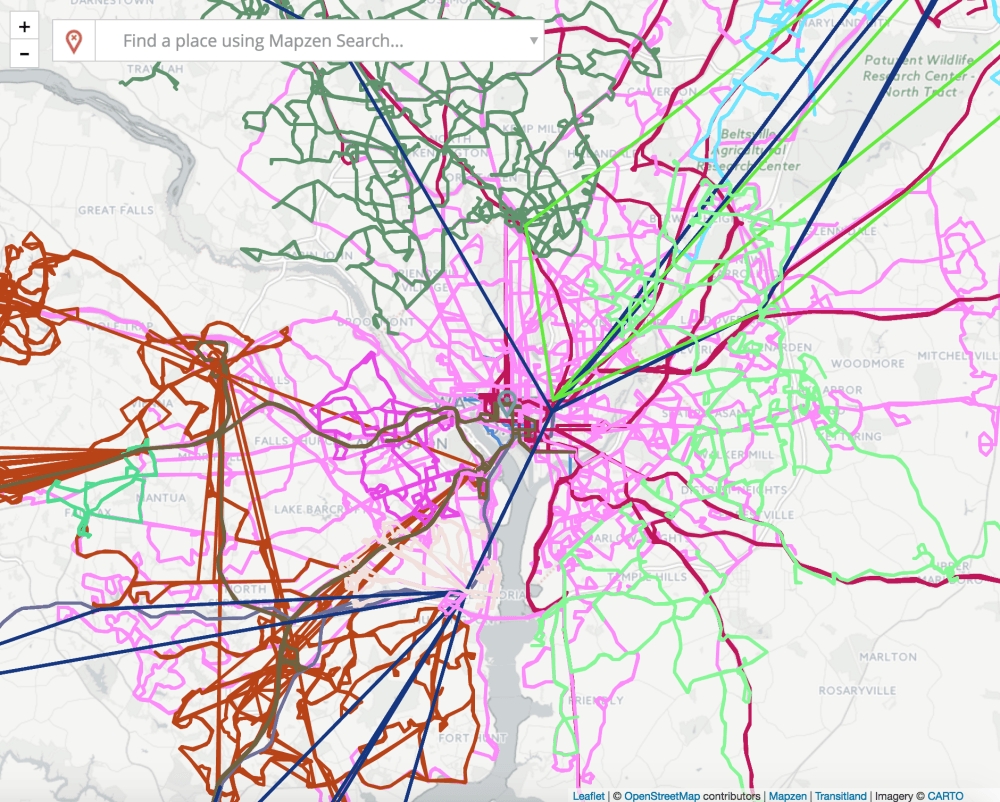
Note that this map is showing routes across multiple transit agencies — this is possible thanks to all transit providers using a common data standard for their schedule and route data.
My favorite feature is the isochrone generator. Isochrones show you how far you can travel from a given point in a given amount of time. Isochrone maps can be used by businesses, other organizations, and residents to make location decisions — and they can even be considered maps of your freedom.
For example, here at Sunlight, we were recently deciding on a new office location. One thing we wanted in our office was accessibility to both current and prospective employees who live all over the city and region. Here’s Mobility Explorer’s isochrone map for our new office:
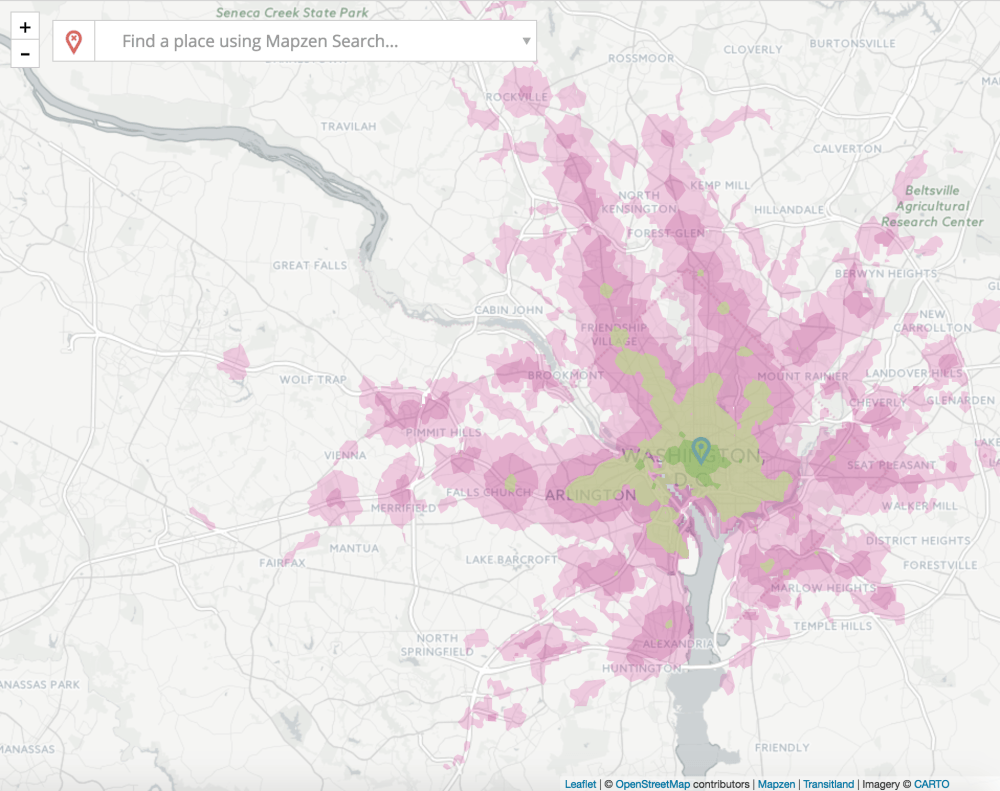
The successive color rings show 15-, 30-, 45- and 60-minute travel times on a weekday morning. So this map shows where in the region employees can live and have a reasonable commute time. What if we had instead located ourselves in suburban Tysons Corner? Our isochrone map would look like this:
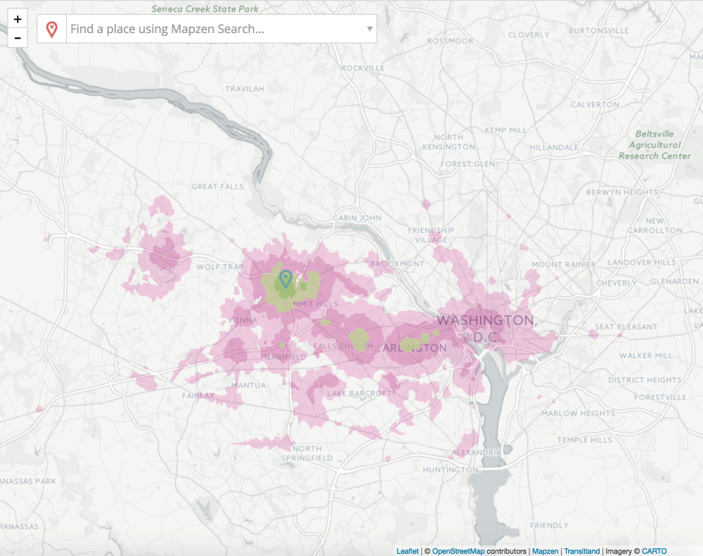
Our office would be transit-accessible to significantly fewer employees, potentially limiting our hiring pool.
These maps could also help someone who’s moving to the region decide where to live based on what jobs and other opportunities they’ll be able to access, or they can tell a prospective business owner what kind of a customer pool would be able to access a given store location. Mobility Explorer can also generate isochrones for driving, biking and walking, and can be produced for any time or day.
Here’s the thing: all of these features are powered by open data, but you don’t need to worry about that data! You don’t need to know what GTFS or CSVs are to be able to use these tools.
We definitely need to keep working to make open data more accessible to the public, but we should also remember that just because the public may not be directly looking at a certain data set, that doesn’t mean it’s not useful or valuable to the public.
Here on Sunlight’s Local team, we’re trying to increasingly focus on open data for impact and not just open data for open data’s sake — so we’re excited to see practical, user-friendly tools that anyone can use, like Mobility Explorer.